

Financial Wellness
This product allows users to see retirement income projections, aiming to drive a higher 401(k) participation through an easy-to-digest experience.
Looking at existing tools

Before embarking on design exploration, existing tools were examined to identify functionality and user pain points. Retirement calculation is a complicated subject with many, many variables. Aside from the dated look, the amount of information that a user had to digest was overwhelming.
Understanding the target audience

An empathetic research was conducted to better understand what retirement and 401(k) meant to people who were not utilizing 401(k) opportunities that their companies offered. 10 candidates participated in 1 hour sessions, which helped develop 4 distinct personas for the project’s target audience. Ultimately a super persona was created - “Debbie Doubtful” - who is a cross between Tracy Transient and Lara Lost. This was to capture a wider audience with a similar tendencies and without sacrificing focused approach.
Being in a user’s shoes - user narratives

With super persona defined, stakeholders from various units came together to write a narrative of “Debbie Doubtful”. Stakeholders included design, product, legal, service, strategy, data science and engineering. Each story was circulated, exchanged and shared to extract specific pain points that the product needed to address, which in turn helped define functionalities required of the product.
Round 1 - Initial concept

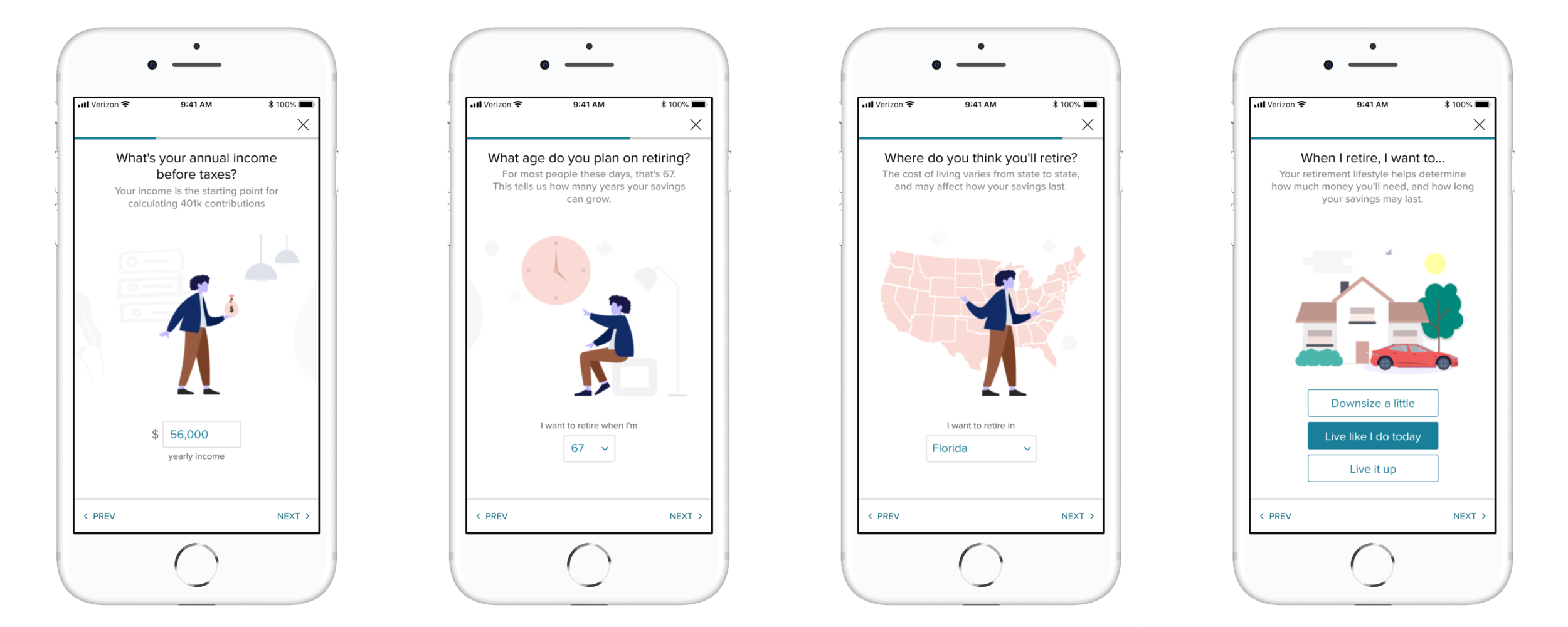
One of technical/functional requirements was information intake from individual user. This meant some form of questionnaire experience was required. The intention was to provide a clean and digest-able chunks to the user - single question per single screen. In order to lighten the heaviness of retirement to reduce the mental fatigue that is associated with questionnaires, simple imageries were used throughout the experience.

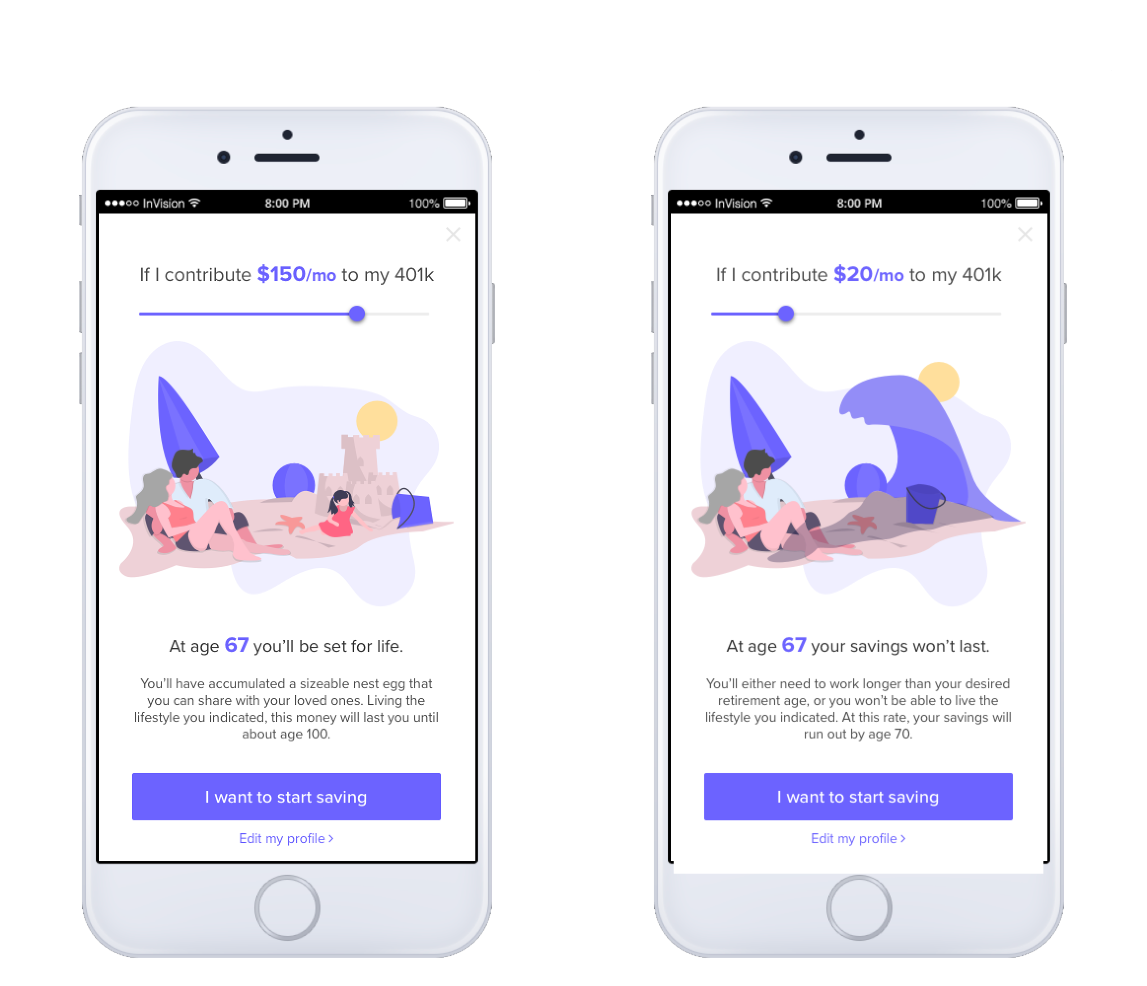
A secondary part of the experience is the calculator, which allows users to “play around” or to “kick the tires” of what kind of retirement they could live depending on different variables and assumptions. As seen above, various attempts were made, but I concluded that above explorations were merely a different visual representation of the existing tool. Time for a little more drastic measures…
Round 2 - Testing the water

The imageries evolved into a tool that holds all the different screens together. In order to provide continuity, a consistent theme would be carried across the steps. In this iteration, an illustrative, cartoon-like character was used. The user research result was quite polarizing, where half of the users felt that it was childish and the others stated that it was quite pleasant.

Concept alternate A
The calculator took a drastic turn and the experience was reduced down to a bare minimum. All information was removed, except for a few critical piece that I assumed would be essential to the users.
Concept alternate B
In this alternate a similar simplicity is present. The difference was to continue the illustrative stories into the calculator and to convey the message through various situational illustrations.
In general, while the testers appreciated the simplicity, they were asking for more numbers, charts and graphs. Whether they actually understood all the numbers or not, the testers felt that retirement, 401(k) & projections had to have some seriousness to how it’s represented.
Round 3 - Refinements

In order to address the polarizing response, the illustration was replaced with a simpler style. No research participant pointed out the illustration. However, 8 out of 10 participant questioned the need for identifying sex. Sex is asked to be used as life expectancy factor in the very complicated retirement calculation. Also tester were questioning on some of the responses being pre-filled, which is extracted from data on file such as birthdate, income amount, etc.

The calculator interface was simple enough for testers to understand. However, the information architecture was not very clear to the testers. The information architecture of this screen was somewhat confusing because the first number at the top did not have the direct correlation to the interactive piece of the screen - the dial.
To slide or not to slide

On a mobile device, swipe on a dial action is fairly common. However jumping to a larger input value was cumbersome because the dial could not accommodate momentum scroll due to development limitation. Internally there was a strong push to use the slider, as the component was easily available, and would shorten the implementation time. However, the slider scale had to fit 0% to 100% at 1% increments, which meant it would be near impossible for users to control a precise 1% increase. After a literal pixel counting, I was able to convince the group to maintain the dial with manual entry to allow for large changes. The moral of the story? Striking the balance between reality and an ideal experience can be quite challenging.
Round 4 - Getting ready for launch

Sex questions was removed as it was generating too many questions. The illustration had to be adopted to be gender-neutral, as well as race-neutral. The subtext under the question was repurposed to explain to the user on how the data was being used in the retirement calculation.

On calculator screen, the dial was positioned low on the device due to human factor reasons. The contribution amount that the dial controls, needed to be placed at the top, because for the targeted audience, affordability was the loudest message that the product needed to deliver. By utilizing the layout, size, color and animation, present action (contribution) were anchored at the top and bottom and projection numbers were placed in between. Yet the content flows naturally from top to bottom.